For week 10 we are collaborating with the team at Operation Fistula to support their mission and to bring more visibility and awareness to the issue of obstetric fistula (‘the worst thing you’ve never heard of’).
The dataset is large in terms of timeframes (1960-2016) and countries included, but many indicators are not consistently reported across years and countries so some analyses will be difficult.
Let’s look at the original first:

What works well:
- The title is clear and succinct
- The geographical spread is clearly defined (Sub-Sarahan) and this definition is reflected in the countries shown on the map
- The metric is explained clearly in the subtitle
- The color legend is easy to understand
What could be improved:
- Adding more contextual information and some insights and/or conclusions in the available space would bring out the impact of this data, i.e. I’d like to know what this means and how things have changed over time
- How does the adolescent fertility rate relate to other indicators? Looking at one metric in isolation for a single year doesn’t tell as much of a story as a view over time or correlating this indicator to others
- The color choice might be perceived as positive, because blue in different shades is often used for positive rather than negative results
What I focused on:
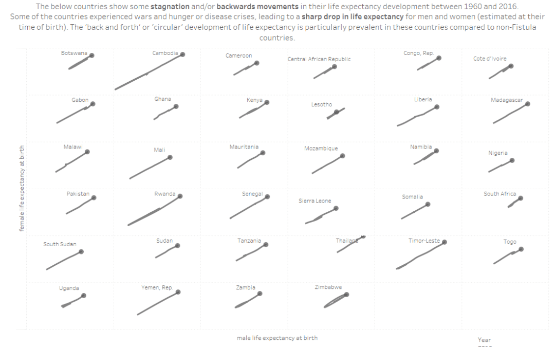
- After reading the data dictionary and exploring different metrics in Tableau, I settled on a view of life expectancy for women vs men over the years
- Life expectancy figures are available for most countries across most years
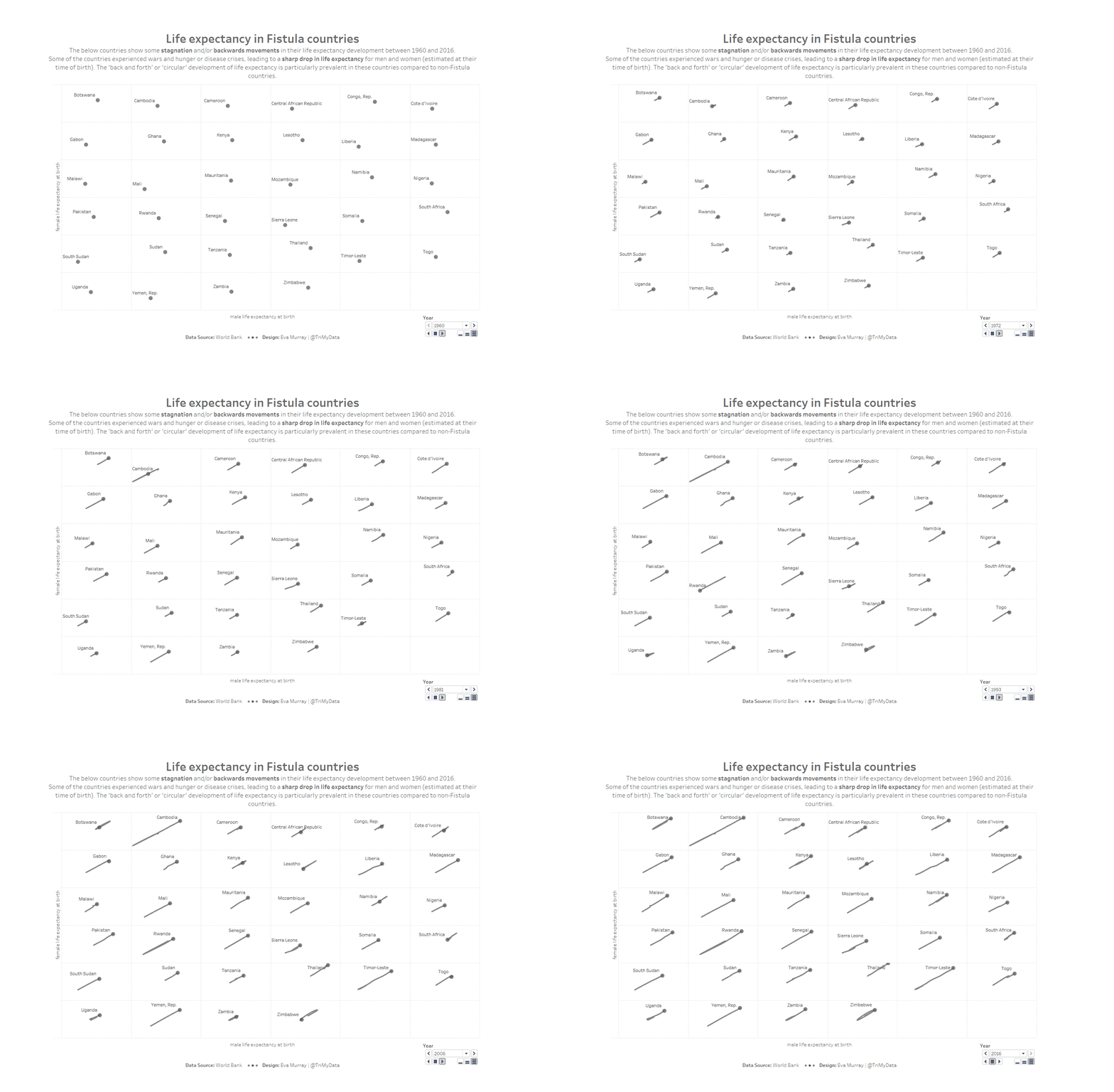
- I looked at ALL countries and used animations to see how things changed and noticed that some countries moved forward in the 60s and 70s, then experienced a backward trend or stagnation before making progress again towards higher life expectancy for women and men
- I focused on Fistula countries as marked in the dataset and filtered down to only those which followed the ‘stagnation and/or backwards trend’ patterns.
- Most of the countries with that pattern happen to also be ‘Fistula countries’, showing that where wars, famine and health crises had a strong negative impact on life expectancy between 1960-2016, there is also a higher prevalence of obstetric fistula
- Here is my animated viz as a gif


