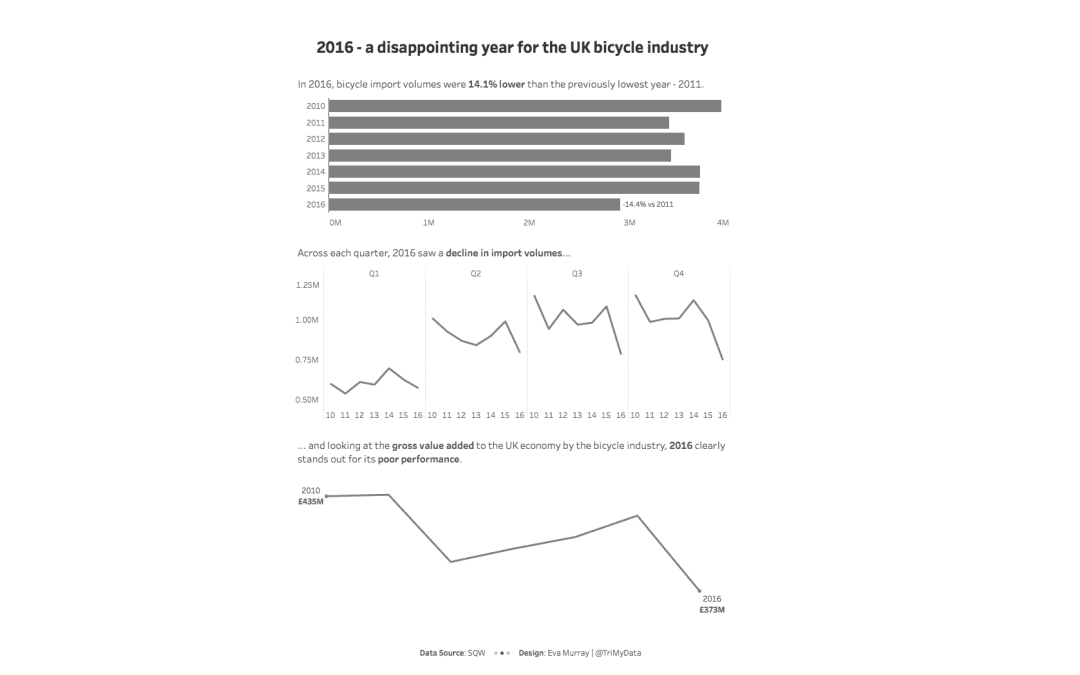
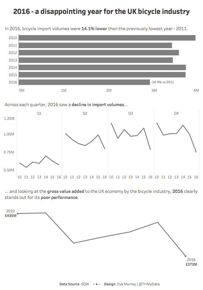
For this week’s MakeoverMonday challenge, we look at data about bicycle imports to the UK from 2010 – 2016.
The original viz comes from a report by SQW and looks like this:

What works well:
- Using a line chart for time series data
- Showing quarterly data
- Labels for each axis
- Data source is included
- Title is simple but sufficient
What could be improved:
- There is a lot of non-data ink, e.g. the gridlines and all those unsightly vertical lines dividing up the quarters and years. This looks messy to me and could be simplified
- The title of the chart, while being sufficient, isn’t particularly interesting. A comment about conclusions or insights would be a valuable addition
- The chart should be taller, it looks squished
What I focused on:
- This dataset is a great opportunity to visualize time in different ways.
- To keep myself within a time limit, I opted for a cycle plot and a standard line chart, and also used a bar chart to visualize results over time
- What stood out to me was the year 2016. While I couldn’t find definitive explanations online for why 2016 was such a ‘poor’ year for the bike industry in the UK, I still wanted to focus on that downturn


