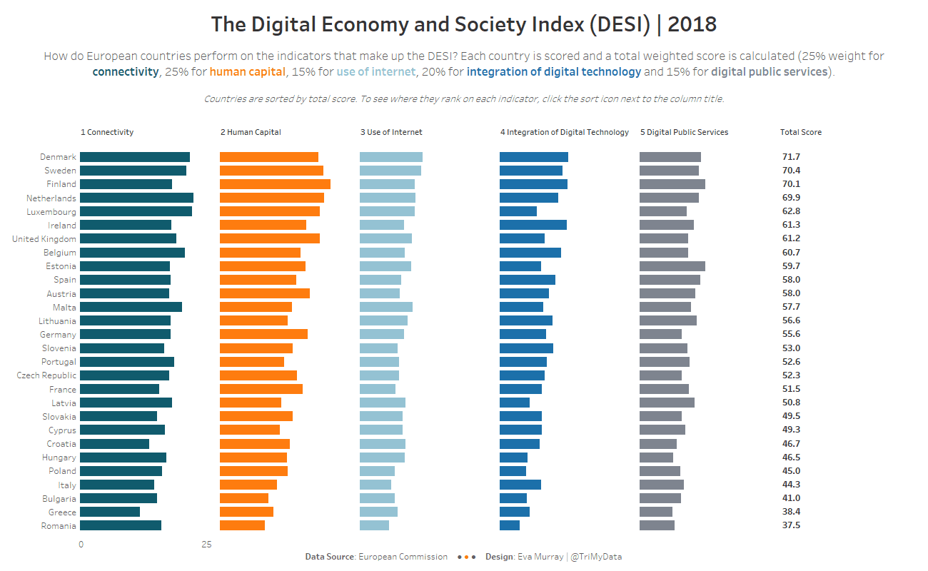
For week 5 we use data from the European Commission about the Digital Economy and Society Index, measuring digital performance for European countries.
The original viz looks like this:

What works well:
- Countries are sorted in descending order from highest to lowest rank
- Bars are easy to compare for their overall length
- Using commonly known country labels
- Clear title
- Simple gridlines
What could be improved:
- Flipping the chart by 90° would leave enough space on each row to show the full country name. This would be particularly helpful for countries like Greece, which has the abbreviatin EL that is not intuitive (most would expect GR).
- The numbering in the color legend is a bit confusing. The color legend would be easier to associate with the bars if it were arranged vertically, just like the bars.
- What is the highest DESI score that is possible? If it’s 100, it would be good to show that so the audience can see how much room for improvement event the leading countries have.
- The stacked bars make it difficult to compare the four top sections, as their position is determined by the bottom section (Digital Public Services).
What I focused on:
- Making the country labels easier to read.
- Breaking the indicators out into individual columns, so they’re easier to compare.
- Giving viewers the option to sort by any indicator they’re interested in, as well as the total score.
- Adding more white space to each column to give the data room to stand out
- Applying Andy’s labelling trick for the x-axis

