I enjoy stumbling across interesting datasets and visualisations and this week that takes us to London, more specifically to 10 Downing St where the Prime Minister lives. The data contains electricity usage for the year 2017 and the original viz from Carbon Culture looks like this:

What works well:
- Overall I like the layout of this dashboard with big numbers, short descriptions of detail below it and the green area chart
- Using green as a color makes sense as all electricity on a green tariff, generated from renewable sources
- The short tagline at the top reiterates my filter choice and tells me what time frame I am looking at
- The labelling of x and y axes is helpful
- The interactivity allows me to find out more, e.g. by clicking on ‘Energy use’ to see further detail, and let’s me highlight specific days with highlight actions
- In the article Carbon Culture states that they are happy to hear how they can become more energy efficient –
What could be improved:
- When I look at the viz, I think ‘so what’? It states the facts but it doesn’t tell me whether the facts are good or bad. For example:
- How do these numbers compare to the previous week? Or the same period in the prior year?
- How do the numbers compare to similar buildings in the region?
- What are some of the biggest energy consuming factors? Surely in winter it’s heating but what else and how many people contribute to this?
- What does the average citizen consume in energy?
- The tagline, while helpful, doesn’t state the year, so when I go back to the prior year, how do I now know which year I’m looking at?
- The two different colors are not explained
What I focused on:
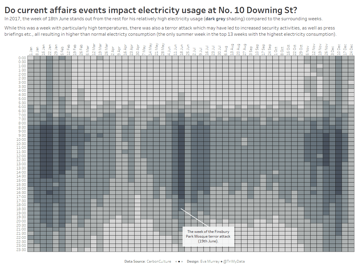
- Heatmaps help see patterns in data, especially when it’s neatly broken down into hours, days, weeks, months and years.
- My goal was to find something of interest. In a timeline view
- I found it interesting that June 2017, especially the week of 18th June, had such high electricity consumption compared to the surrounding .weeks and chose to focus on those data points.
- A bit of online research showed that on the one hand, there were paticularly high temperatures, so it could be that air conditioning etc. caused the spike.
- On the other hand there were two terror attacks that month in London. One on London Bridge on 3rd June and one at the Finsbury Park Mosque on 19th June.
- While I don’t have proof, my suggestion is that higher than usual levels of security and media activity surround the second attack may have led to the higher electricity usage during that week.

