Week 3 is upon us and we’re moving from Freedom of the Press to minimum wages in the US.
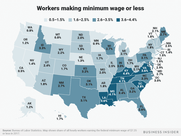
The viz to makeover this week is the following map showing for each stage the percentage of workers earning the minimum wage or less.

What works well:
- A map is often a viz many people find engaging and feel drawn to so it grabs the attention of the audience and also provides the geographical context for the data
- The title is simple and succinct
- The color gradient draws our focus to the states with higher percentages of workers at or below minimum wage
- States and percentages are labeled clearly
- Hawaii and Alaska are included as small inserts to avoid having to create a very large map with large gaps
- Good footnote
What could be improved:
- To me the blue color doesn’t suggest anything negativ while a higher percentage of workers at or below minimum wage is something to highlight so I’d propose that a different color would be a better fit
- I’m interested in changes over time but can’t see those here. The map only provides a snapshot of a point in time
- What’s the national average? Are these numbers good or bad and is there a benchmark we can compare them to?
What I focused on:
- I built a number of different charts to get a better understanding of the data
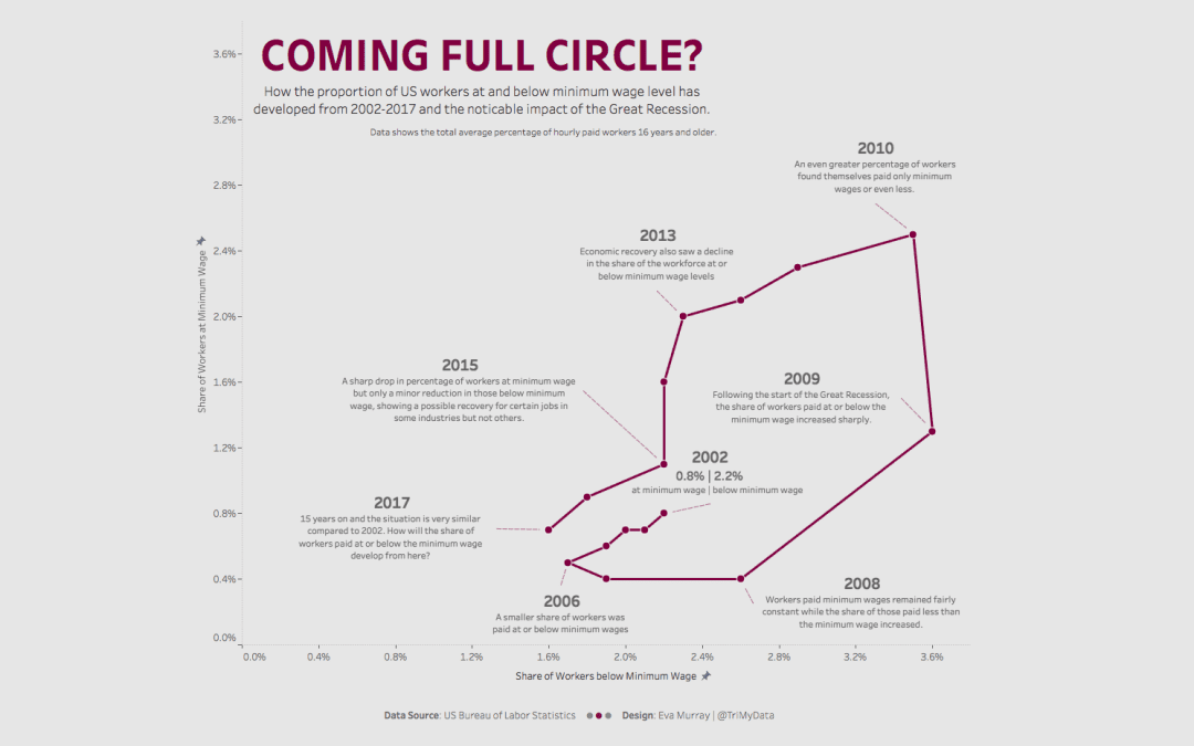
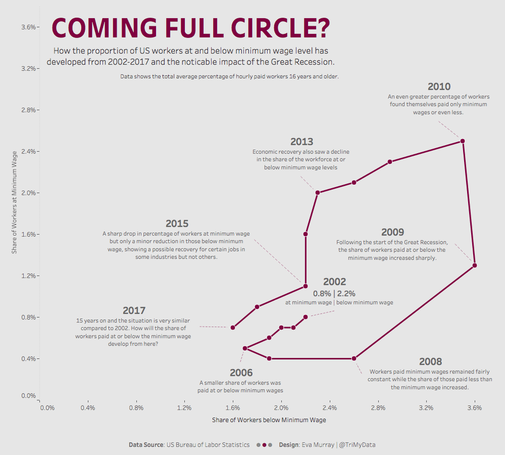
- Visualizing the different states’ numbers over time gave me the idea to put the two measures, % at minimum wage and % below minimum wage, in relation to one another
- In addition I wanted to also see how things changed over time so I created my first connected scatterplot.
- I noticed the almost circular development over time and found it was worth annotating several years to describe the changes and connect them to the impact of the Great Recession.
- This is my viz (click on the image for the interactive version)


