And here we are, week 52 of 2018. Another year has come to an end. It’s year 3 for #MakeoverMonday, the social data project, year 2 for me being part of this project and I get to look back on two eventful and exciting years of driving this project for the dataviz community.
To close out the year, I decided to pick an easy and simple dataset so people spend more time with others and less time in front of a screen.
For this week’s challenge, we look at Christmas spending in the US.

What works well:
- Line charts are generally easy to understand
- Simple colors and labels
- Y-axis label is pretty clear
- Column banding to show the different years across the x-axis
What could be improved:
- Include a title with the image
- The labels look cluttered, I’d reduce the number of labels that are shown – do we really need to see them for each year?
- The interactivity doesn’t feel like Tableau to me – are they sure this was visualized using Tableau???
What I did:
- Added changes from one year to the next in tooltips
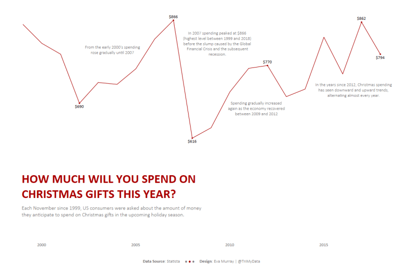
- Only showing labels for selected years
- Annotating the chart to guide people from 1999 to 2018 and what happened
- Done. Christmas time.

