It is week 50 already and where has this year gone? The 50th week of Makeover Monday in 2018 and another opportunity to improve the way we visualize and analyze data.
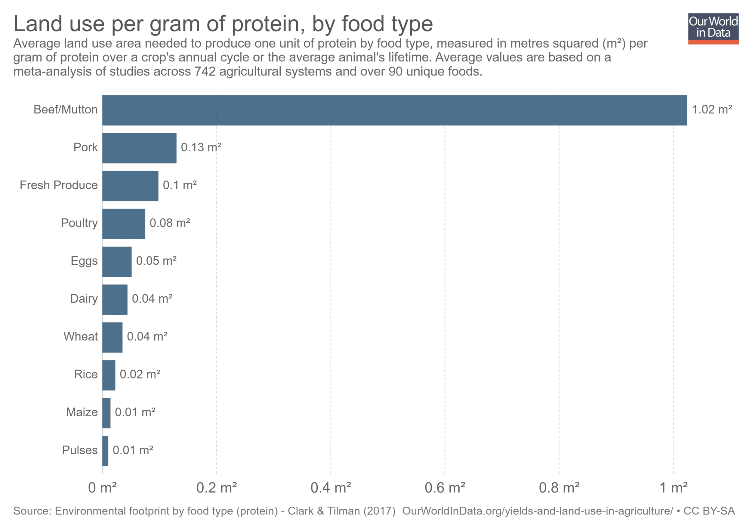
This week we’re looking at the land use for producing different food types.

What works well:
- a neat simple bar chart
- using a single color
- a clear title with a descriptive and informative subtitle
- the data source is clearly stated
- good axis labels
What could be improved:
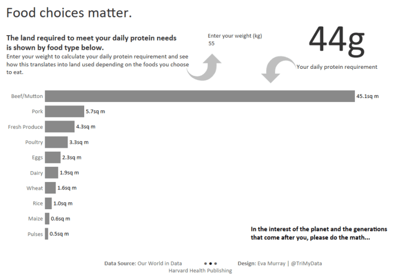
- the data could be presented in a way that is more relatable. Rather than calcilating the land use for 1g of protein, why not do it for the daily protein requirements of an average adult?
- the title could be more interesting to draw attention
- it would be good to include some annotations or key findings rather than just reporting the numbers. This would answer the question ‘what does this mean for me and why should I care?’
What I did:
- I don’t have much to critique about the original and wanted to focus on making my viz something personal that makes people think
- I chose to include a parameter where people enter their weight to see their own daily protein needs and how that translates into land use by food type.
- Here is the viz. Click on this text to view the interactive version

