As we head into ‘silly season’ and are only a few days away from December with all its Christmas parties, having a look at the cost of a night out in different cities around the world gives us an appreciation for how much a bit of entertainment will set you back.
This week’s chart for #MakeoverMonday comes from Statista and looks at the combination of different costs for a night out.

What works well:
- The title is short and to the point. While ‘a night out’ means different things to different people, the general idea is pretty clear and the subtitle followed by the color legend quickly shows what’s involved.
- The colors are nice and bright and easy to distinguish from one another
- The x-axis labels help to quickly see the overall magnitude of costs
- The city labels are nice and large
- Everything is in a single currency
What could be improved?
- It’s too colorful. The bars have bright colors, the flags arevery colorful and the icon also adds further distraction. What is actually important here?
- What is the currency? We can probably assume US$ but the $ symbol is used for many different dollar currencies around the world (who would have thought…) and it needs to be clearly stated in the viz what currency we’re dealing with
- The flags are unnecessary and make the viz look busy. The icons in the bottom right corner are also not adding value and can be removed
- The subtitle would be more valuable if it stated what the ‘night out’ includes, i.e. the four different things people spend money on in this example
What I did:
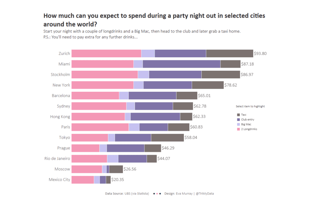
- A simple Makeover from me this week. Addressing some of the issues I found with the original image above
- No crazy colors, no icons, no flags
- Moving the color legend to a more subtle location but a place where it can be seen more easily
- Using the legend for highlighting so viewers can compare different items more easily
- Click here to see the interactive version


