After a very active day of redecorating, cycling, running and (somehow) a yoga lesson, the only thing I can still move with some coordination are my fingers on the keyboard, so let’s get into this week’s Makeover Monday challenge.The original viz comes from howmuch.net, a website that features many creative (if not questionable) data visualizations. But they are engaging and they do get people to think about various topics in their lives and around them, so have a look:
What works well:
- It’s a map with 3D things exploding of it and while that’s not a good thing, one thing is for sure: It gets my attention straight away. Colors and some crazy shapes.
- The title seems simple enough to understand
- The labelling includes the city and state names, as well as the hours, this helps
- Sources are clearly stated
- The calculation logic is included
- The color legend is clearly visible
What could be improved:
- The 3D bars in all sorts of locations make it impossible to compare cities, unless I do the comparison in my head based on the labels, in which case the map and bars are useless
- Why are the 10 cheapest places labelled but none of the blue ones and 12 of the red ones?
- How is the coloring and categorization into good and bad determined? What percentage of someone’s take home pay seems to be a fair amount to pay for the mortgage?
- The article’s description of the calculation is very confusing. It also doesn’t state whether the median household income is before or after tax. That’s important because it’s only from my take-home pay that I can pay the mortgage
What I did:
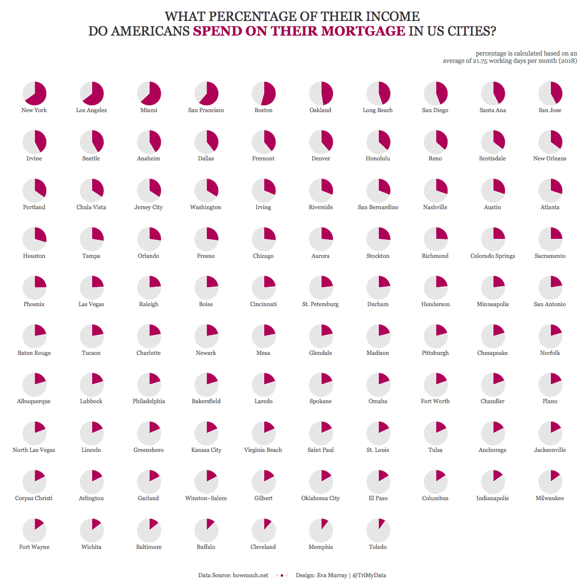
- I decided that today was the day to learn how to do a trellis chart and thankfully Andy had a very quick solution for me involving table calls. Thanks Andy 🙂
- Why the trellis pie charts?
- A bar chart showing every city would have been too tall or too wide
- Showing only a few cities would have required explanations
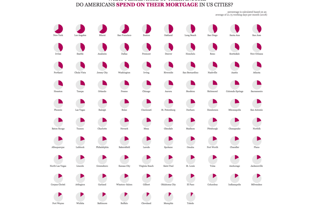
- A pie chart that adds up to 100% is easy to understand when it only has two segments. For example, New York and LA make it easy to see that ‘almost 3/4 of the working time is required just to pay the mortgage’ while in Oakland it’s ‘a little less than 1/2’ and in Richmond we’re at ‘about 1/4’.That is visible without any further information. For details, viewers can hover
- I like how the pie chart also makes it easy to see how much time is spent working to afford ‘everything else’
- Trellis charts feel like a badass way to show lots of dimension members in a single compact view
- I chose Georgia as a font because of its newspaper look.


