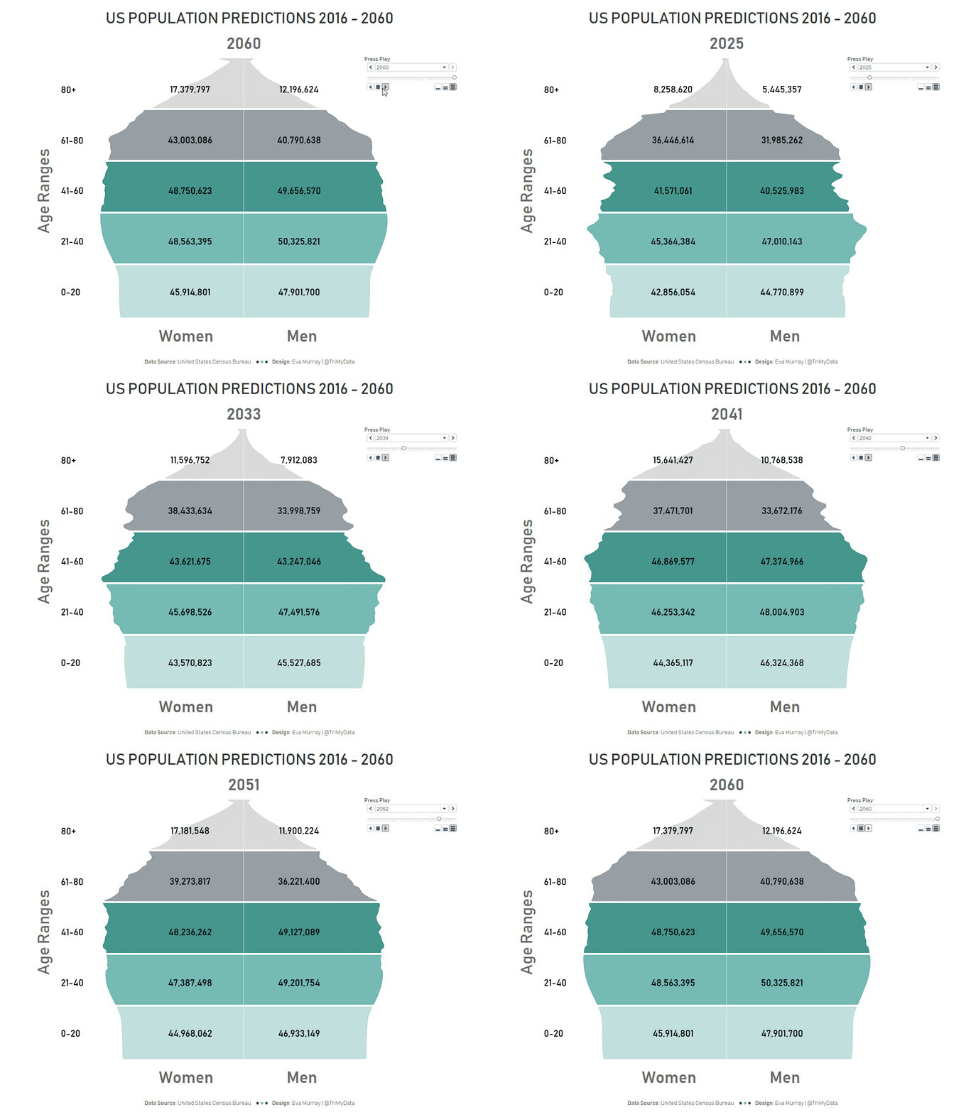
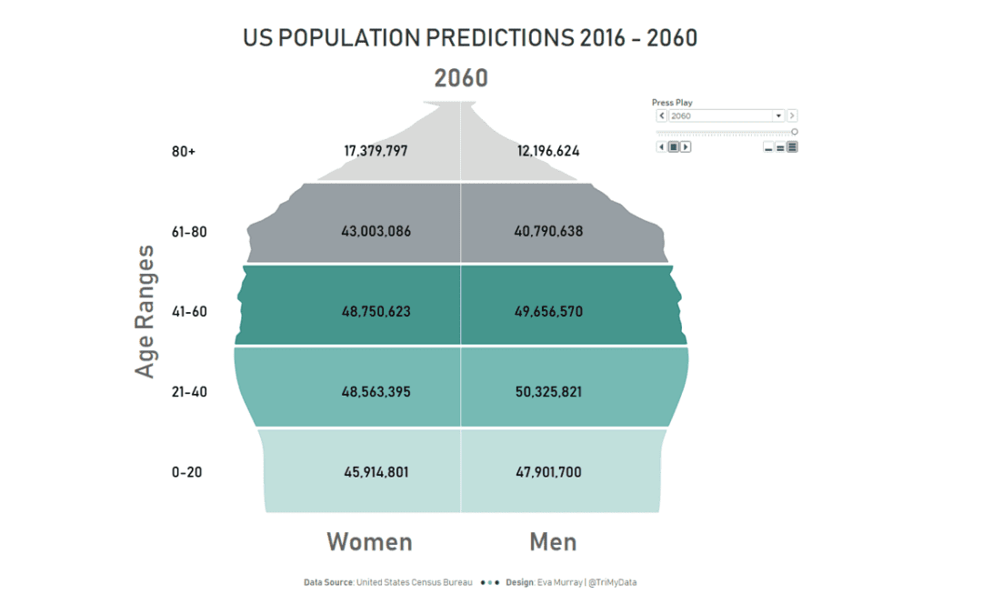
For this week’s Makeover Monday we’re analyzing US population prediction data. Population is a fascinating topic and having such a neat dataset available certainly helps to explore it further.The original viz looks to predict when the number of older adults will overtake that of children for the first time. That year is going to be 2035 if things continue to trend as they are.
What works well:
- Clear colors to distinguish children vs older adults
- Effective labeling with clear and large numbers and labels
- A title that captures my attention and a nice explanatory subtitle
- The data is in the center of the image and stands out
- Simple metrics: percent of population
What could be improved:
- The blue banding of the title and footer is quite distracting
- The timeline for the bar chart looks a bit odd with the gaps. Wouldn’t it be helpful to see the trends?
What I did:
- Right from the start I knew I wanted to work with a population pyramid, so I started with that.
- I managed to create this viz, including the formatting, in an hour while travelling from the airport to a meeting in Paris. I had some input from my colleague Valerie who suggested I should use animation (initially I planned to create small multiples of the population pyramid, but animation is SO MUCH BETTER)
- Even though animations don’t work on Server or Public, I find this viz comes to life because of the feature and it’s the best way to show the changes over time. Seeing the shape of the pyramid change over time is fascinating!
Click on the gif to view the viz on Tableau Public. It won’t be interactive, but if you want you can download it and play with the interactive version in Desktop 😊. 


