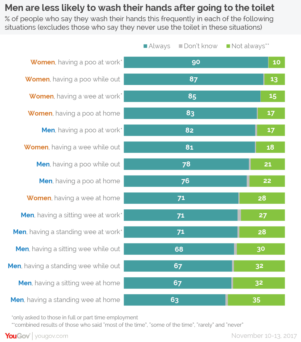
Tackling this Makeover Monday dataset in a slightly zombie state while waiting for my connection from London to Frankfurt as I fly home from TC18 in New Orleans…And then there is a dataset about poo. Who would have thought? But sometimes we need something as ordinary as that to keep things from getting too serious :-).So here is the original viz…
What works well:
- Simple bar chart that adds to 100% for each category
- Large numbers to label each bar
- Descriptive labels for each category
- References to data source and timeframe of the survey
- Descriptive title and subtitle
- Distinct colors
What could be improved:
- The color for ‘not always’ is green, but green to me indicates something positive where in this context it is something that makes me go ‘ewwww’
- There are a lot of categories for men and women and where they poop or pee and how they do it. This results in a lot of bars and makes it hard to draw any real conclusions
What I did:
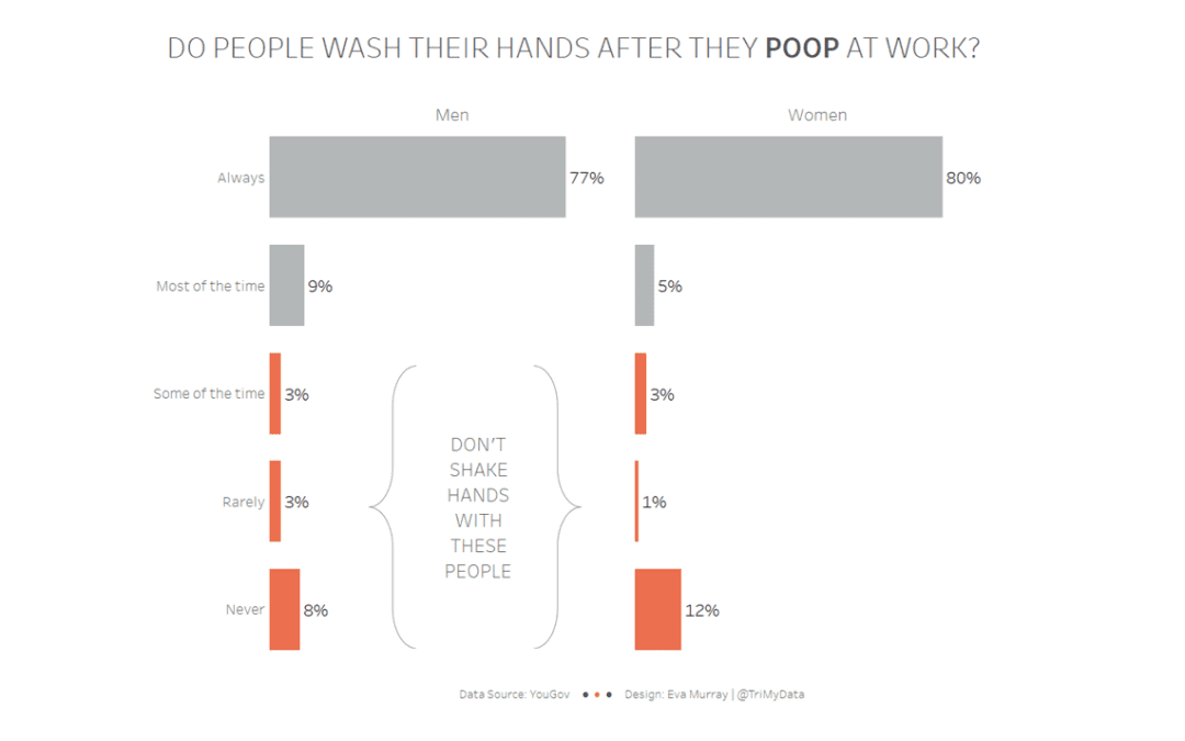
- Focused on the category of ‘at work’
- Created a simpler bar chart
- Decided to highlight the ‘ewww’ people who I wouldn’t want to shake hands with (if I knew who they were)
Click for the interactive version


