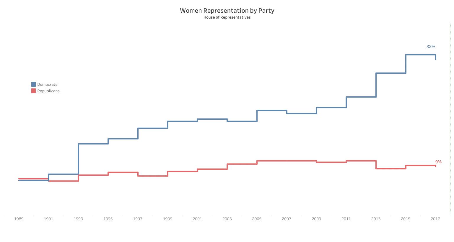
The last few weeks have been nothing but infuriating when it comes to US politics and the abysmal and ridiculously antiquated opinions that have been brought to life. Not only are some people living somewhere in the 19th century, but they have the audacity to say so and treat women like something rather than someone.Suffice to say, I have been feeling it and have spent the past month or so in a constant angry mood. (at this point I should say thanks to Sarah and Andy for listening to and reading my rants)It’s not fun to be angry, but it’s really important and if the last two years of Trump being in charge and things going backwards have achieved anything, it is that things are finally being talked about, people are getting angry and that – compared to lethargy and passiveness – will hopefully see things change for the better.This week’s dataset looks at the percentage of women in the house of representatives. The original visualization comes from Stephen Pelkofer and uses stepped lines to show the two major parties:
What works well:
- The colors are an obvious choice
- The viz is very simple and focuses on the essential message
- The timeline on the x-axis is clearly labeled
- The size and aspect ratio of the viz is good
What could be improved:
- While the message of the line chart is obvious to those familiar with data, it would be great to actually state clearly what the insights are
- The title isn’t as impactful as it could be – a strong message would make this stand out more
- There is a lot of white space in the viz that could be used to annotate the line chart, e.g. dips and peaks (why did they happen and when, etc.)
- I miss the story overall – I am sure there is more in this dataset that could be brougt to life
What I did:
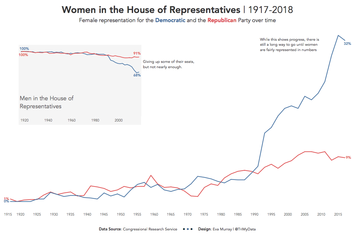
- A simple line chart, keeping the red and blue and extending it to go all the way back to 1917
- Added in a small line chart showing the men’s share of seats in the House of Representatives
- Formatted tooltipsClick to view on Tableau Public

