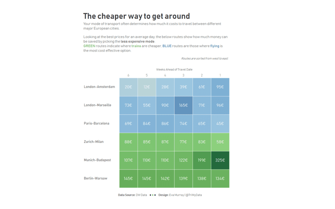
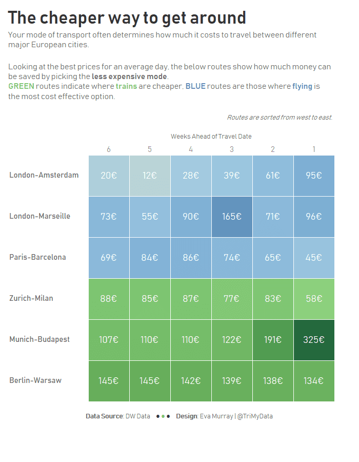
Faced with this question for my very frequent trips which see me to go different places at least twice a month, I actually stumbled on this viz and dataset through my twitter feed and thought it would be great for MakeoverMonday. Not only is the data nice and simple, but the information in the article is easy to understand, the topic is something many people can relate to and it will hopefully be a fun and easy week for people.Here is the original visualization which comes from DW Data, a part of Deutsche Welle, an excellent news source for German current affairs in German and English and other languages.
What works well:
- Great title that grabs my attention
- Underlining planes and trains in the subtitle helps me understand the meaning of the colors
- Great color choice, they’re easy to distinguish
- Labelling for different line charts is simple and effective
- Source is clearly stated
- Clarification of prices below the charts helps to give context
What could be improved:
- The viz looks squished together, there isn’t much space between the different elements
- The lines are fairly flat
- It would be great to highlight when trains are cheaper than planes and vice versa (this is included in the article but not the viz)
- The text below the viz is quite large, it would be great to vary font sizes according to the importance of the text across the viz
What I did:
- I wanted to make it easier to see which mode of transport was cheaper for a given route
- I also wanted to show hoe much cheaper it is to choose the train over the plane or vice versa


