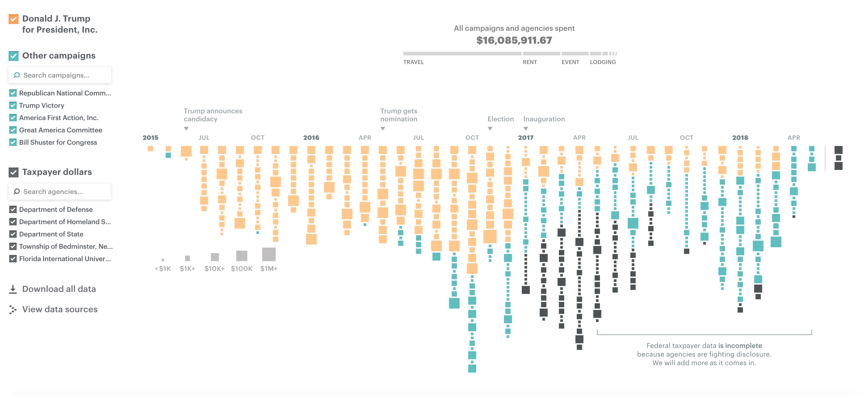
For week 37 we are looking at the spending of people and organisations with funds going to Trump’s companies. Interesting topic, even though I’m not a huge fan of political data because it typically infuriates me. Especially when Trump is involved.The original viz is from ProPublica and shows the spending by the President, by campaigns and by government departments.
What works well:
- the design is eye catching and interesting
- patterns are visible over time of increased spending and spending in the different categories
- the larger squares indicate larger sums, which is intuitive
- the color choice is great
- the large number displayed at the top is helpful, together with the additional information displayed
- the interactivity is great
What could be improved:
- as someone with limited knowledge of (and admittedly interest in) US politics, I find the description at the top very light. I would prefer more information to help me make sense of the data and form my own opinion.
- what’s Donald Trump for President Inc in this context? Is that a corporation behind his campaign to become president or is that him as a person?
- and if I were the American taxpayer, wouldn’t only the dark grey boxes be relevant because that is something I’d feel directly affected by?
- as you can probably tell, I don’t really get it. I’m just as outraged as the next person about the muppet in the White House but I’m not sure how to use this viz as a basis for judging the situation.
What I did:
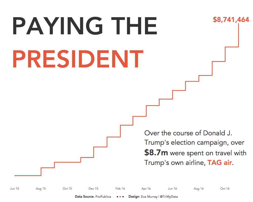
- Finally some nice time series data. I didn’t have much time to work on this (there seems to be a pattern…), but I knew I wanted to focus on changes over time
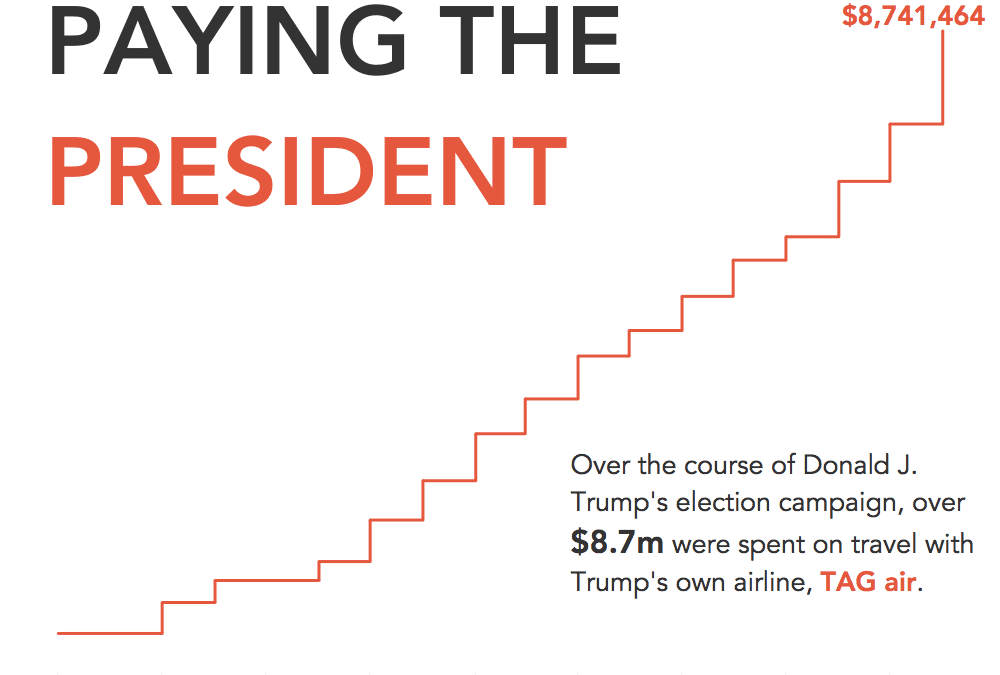
- Looking at the different spending categories, travel certainly stood out for me, specifically the spending on TAG air which is owned by the not so beloved US president
- I decided to focus on just the pre-election spending on TAG air by the election campaign (Donald J Trump for President, Inc.) and used step lines to accentuate the running total
- Placed the title ‘into’ the viz rather than on top because the left and right side of the line offered a lot of white space.


