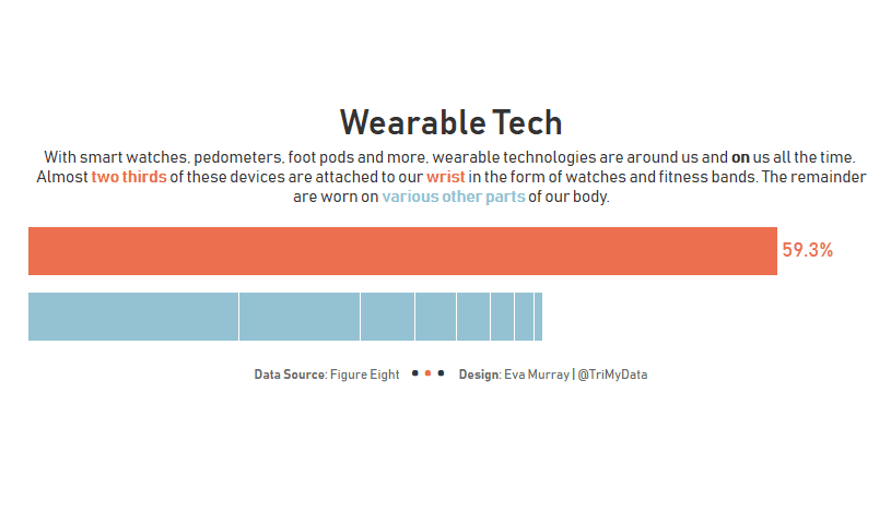
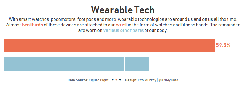
Thanks Andy for making it easy for us this week with a simple bar chart to make over, looking at wearable technology and which body part we attach devices to.Here is the original:
What works well:
- Sorted in descending order from most common to least common location
- Simple bar chart, with basic labels and large numbers. Don’t really need much more
- Title is short and self-explanatory
- Data source and creator are included
What could be improved:
- Why pink? Nothing in the article or on the website makes me understand this color choice and it seems unnecessarily bright. Something a bit toned down could work better
- The pink label ‘Wearables’ on top of the bars seems superfluous
- The small dashes between the location labels and the bars are unnecessary
What I did:
- A viz in a single sheet, comparing wearables for your wrist to those for other parts of the body
- A small viz that focused on the essentials
- A new style for my footer


