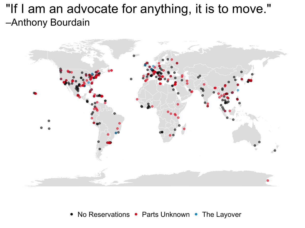
Anthony Bourdain – yes he is a legend and his recent death upset food-loving travelers across the globe. I wasn’t his biggest fan and certainly didn’t agree with enthusiasm for eating animals, but he was an influential personality and I’m sure he awakened a love for good food and travel in countless people.Andy’s choice of dataset this week is one that summarises Anthony Bourdain’s travels as he cooked and filmed in different locations to show people what and how others eat.The original visualization comes from Christine Zhang and looks like this:
What works well:
- A simple map that people can easily recognize and that depicts how far and where Anthony Bourdain travelled for his different TV shows.
- Simple color coding for the three shows Christine looked at
- Personalizing the visualization with a quote from Bourdain, which also – at least for those who know (of) him and his shows – sets the scene for the map
What could be improved:
- Reducing the opacity of the circles to ensure the overlapping circles can still be seen
- Adding a subtitle or description to the visualization to provide more context and explain what we’re looking at
- Using colors that are easier to distinguish from one another
- Including the data source and author’s name
What I did:
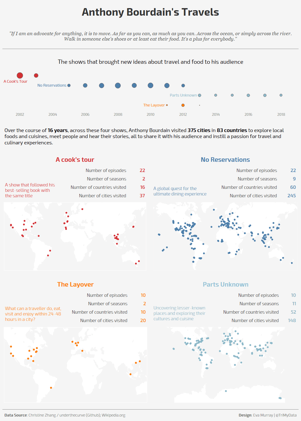
- I felt the data and Anthony Bourdain’s legacy warranted more of a story and not just a simple viz like I usually create them.
- My challenge is that I am no designer so when it comes to page layout, I very much stick to a simple and symmetric approach rather than something more eloquent
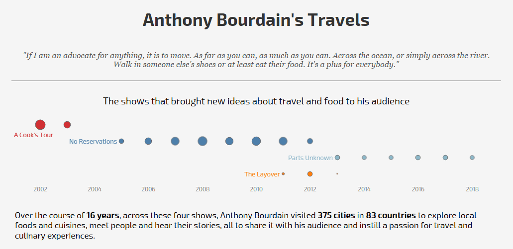
- So I decided to characterize the four shows a little bit, and highlight the places visited with small maps.
- The dataset is fascinating and I’m sure it holds many stories, unfortunately my time is limited, so here is a simple overview of Anthony’s travels


