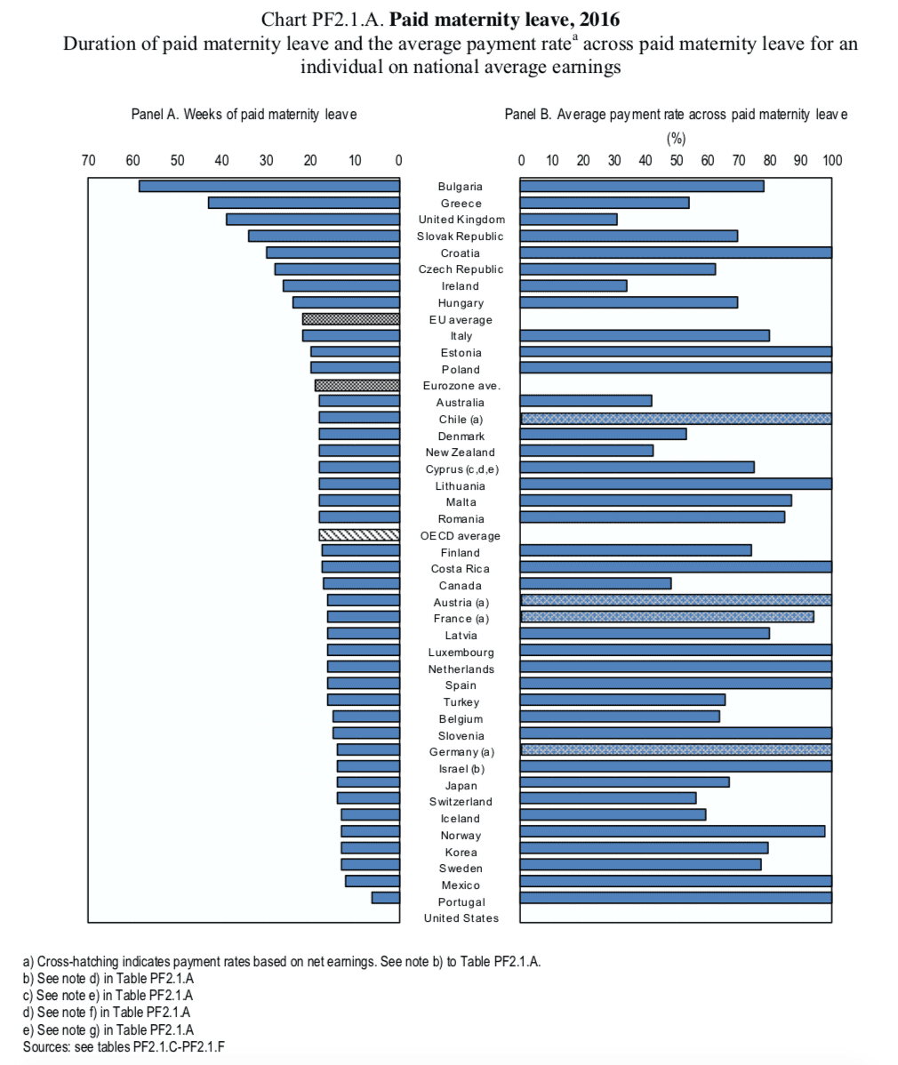
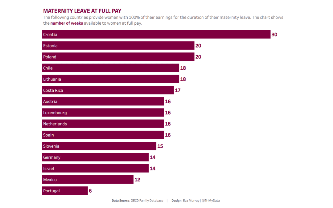
In the past few days I noticed a number of discussions on social media around maternity and parental leave in different countries and, more specifically, the lack of paid maternity leave in the US. So I chose a dataset that shows the number of weeks of maternity and parental leave available in different countries.Here is the original visualization from an OECD report: 
What works well:
- Countries are sorted by the weeks of maternity leave available
- Showing the payment rate for each country side by side with the duration is good for context, because it puts the actual duration in perspective
- Notes (not shown in the above image) in the report below the chart were very helpful for understanding the metrics
- Simple color palette
- Subtitle contains helpful descriptions
What could be improved:
- I find it confusing to see the avg duration for EU, Eurozone and OECD but not a payment rate to go with it on the right hand side
- The chart contains a lot of countries which makes it very busy. It would be helpful to have an interactive visualization with filter and search options
- What does the shading of some of the bars mean?
What I did:
- There are lots of different stories that can be told from this dataset so I chose to focus on a subset of the data
- While a number of countries offer significant amounts of maternity leave, a lot of them pay far below the full earnings during that time, so I decided to focus on those that do.
- I picked a simple color palette that works for the topic but isn’t ‘stereotypically pink’
- I decided to, once again, create everything in a single chart, using Andy’s technique of putting the footer into the ‘caption’ so it all gets displayed in a single chart


Hello, do you think it would be good idea to analyze correlation between fertility rate and maternity leave?
Sure go for it
Whilst I understand that the dataset is complex, and you wanted to make a simple chart, it also leaves out quite a lot. For instance, whilst Denmark does not by law give women 100% of their pay (unless they’re unemployed, in which case they do get 100% of the money they would have otherwise had), quite a lot of the work force is employed under trade agreements with unions, which will give them a number of weeks, sometimes up to 26 weeks, on 100% of their pay, or failing that, the equivalent of what they would have gotten, were they unemployed.It basically means that whilst not all women will get any time with 100% pay, no one will be left with nothing, and quite a lot will get 100% for varying periodes, depending on the agreement they’re employed under.I’m curious as to your thoughts on representing facts in full vs. the constraints when creating the graph?
Hi Lise,Thanks for your comment. I have no doubt that some of the details are not in the dataset.My focus when it comes to Makeover Monday is not the visualization itself. My focus is to run the project which requires about 15 hours of work in my personal time, and Andy spends the same amount at his end.The value I add is not in creating a viz and writing a blog but in providing this project to people as a platform for their own learning.Our priority is to give people access to a variety of topics with a fresh dataset each week, different types of challenges, metrics and visualizations.We also focus on creating opportunities through collaborations with non profits and other organizations, helping our participants to grow their network.Andy and I provide feedback every week in a 75min webinar and through the summary blog post at the end of the week.We setup and host live events and help people organize these in their own workplaces.In short: we do a lot behind the scenes to add the maximum value possible for this project.So while I would love to research every topic in depth and document and visualize the entire analysis process, there simply isn’t enough time for that. I’m a participating facilitator with the emphasis on facilitator.The datasets we provide contain the information required to first recreate the original chart (to ensure the author understands which metrics should be used) and for people to then create a makeover, a visualization that more effectively communicates the data and insights.I’m happy for people to enrich their vizzes with additional data as they see fit but we don’t expect or require it for the project.
Hello,What about the leave dedicated for father? I live in Norway and in Norway, the father of child also get 10 weeks with full pay.Without taking it into consideration, it gives maybe a bit wrong picture “parental leave”.Or what do you think?
It wasn’t in the data so I didn’t use it