For week 27 we will have two datasets. The official Makeover Monday dataset about Rat Sightings in NYC as well as a secret, yet-to-be-revealed dataset which we’ll use at TC18 in London this coming week.For now, let’s check out what Splinter and his mates have been up to…The original viz comes from Jowanza Joseph:
What works well:
- Great visualization of the trend that reported rat sightings are increasing (likely also due to improved reporting capabilities via smartphones)
- The purple trend line helps to show the pattern clearly
- Seasonality is also clearly visible in this chart
- Neat axis labels, simple and clean design overall
What could be improved:
- I really like the chart and looking at it in the context of the entire page, my one comment around the color would be that the purple isn’t really necessary here and doesn’t work so well with the colors chosen in other charts
- I’d like a bit of interactivity, the ability to filter a couple of dimensions like location, time of day or building type
What I did:
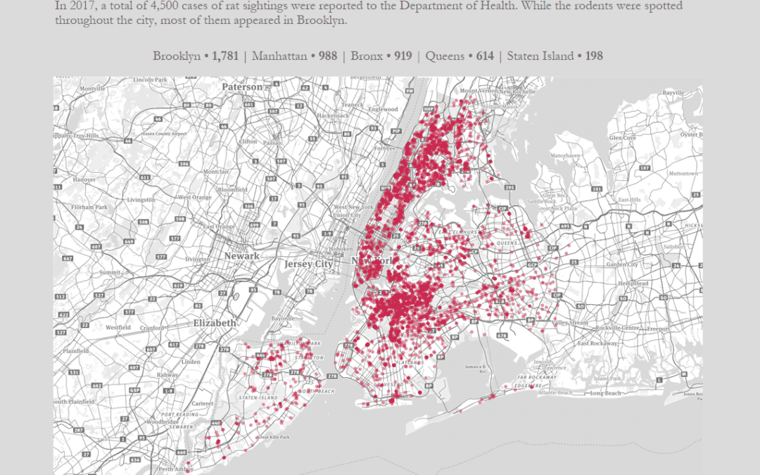
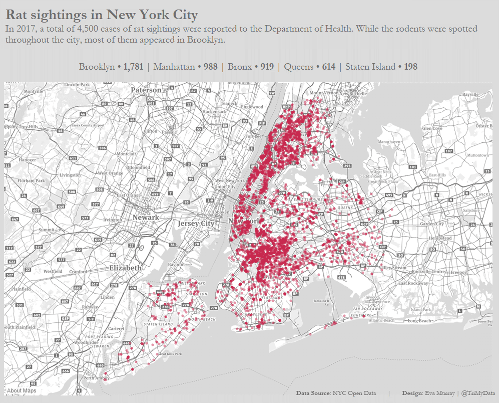
- A very simple Makeover this week simply looking at rat sightings for 2017 mapped based on their locations
- after yesterday’s race and the resulting late night, as well as a 4am start to travel to London this morning, there was nothing else left in the dataviz tank…


